Color Consistency Brochures
Designed tri-fold brochures demonstrating color consistency across HP Indigo presses, serving as a valuable tool for sales teams.
Brief:
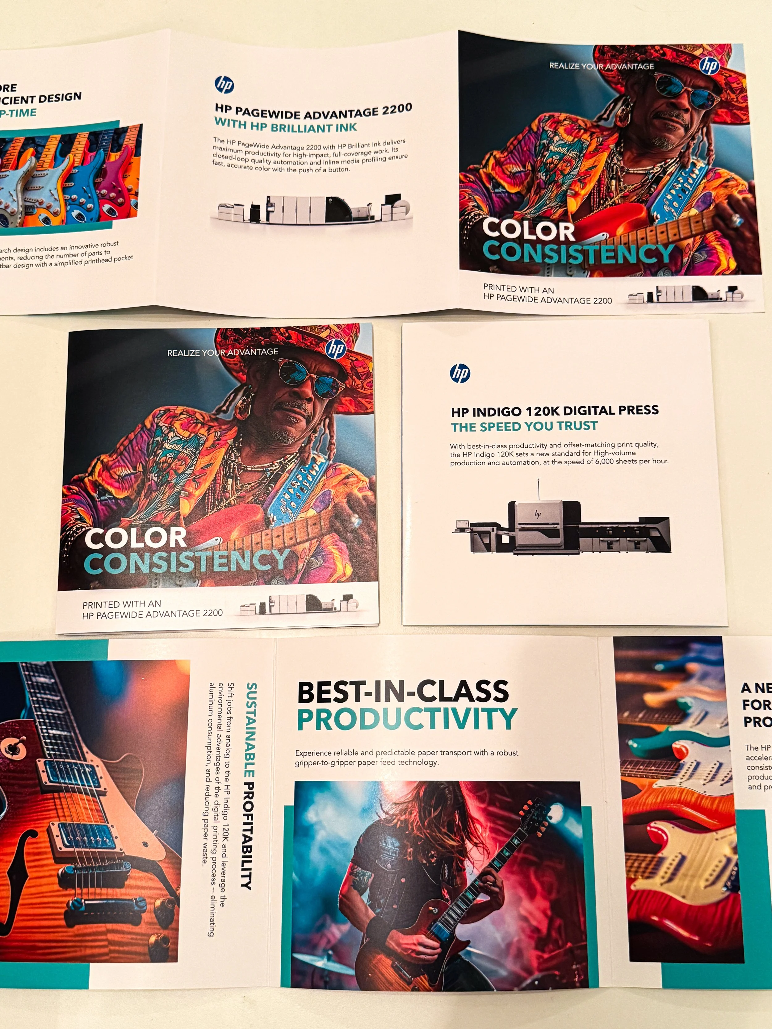
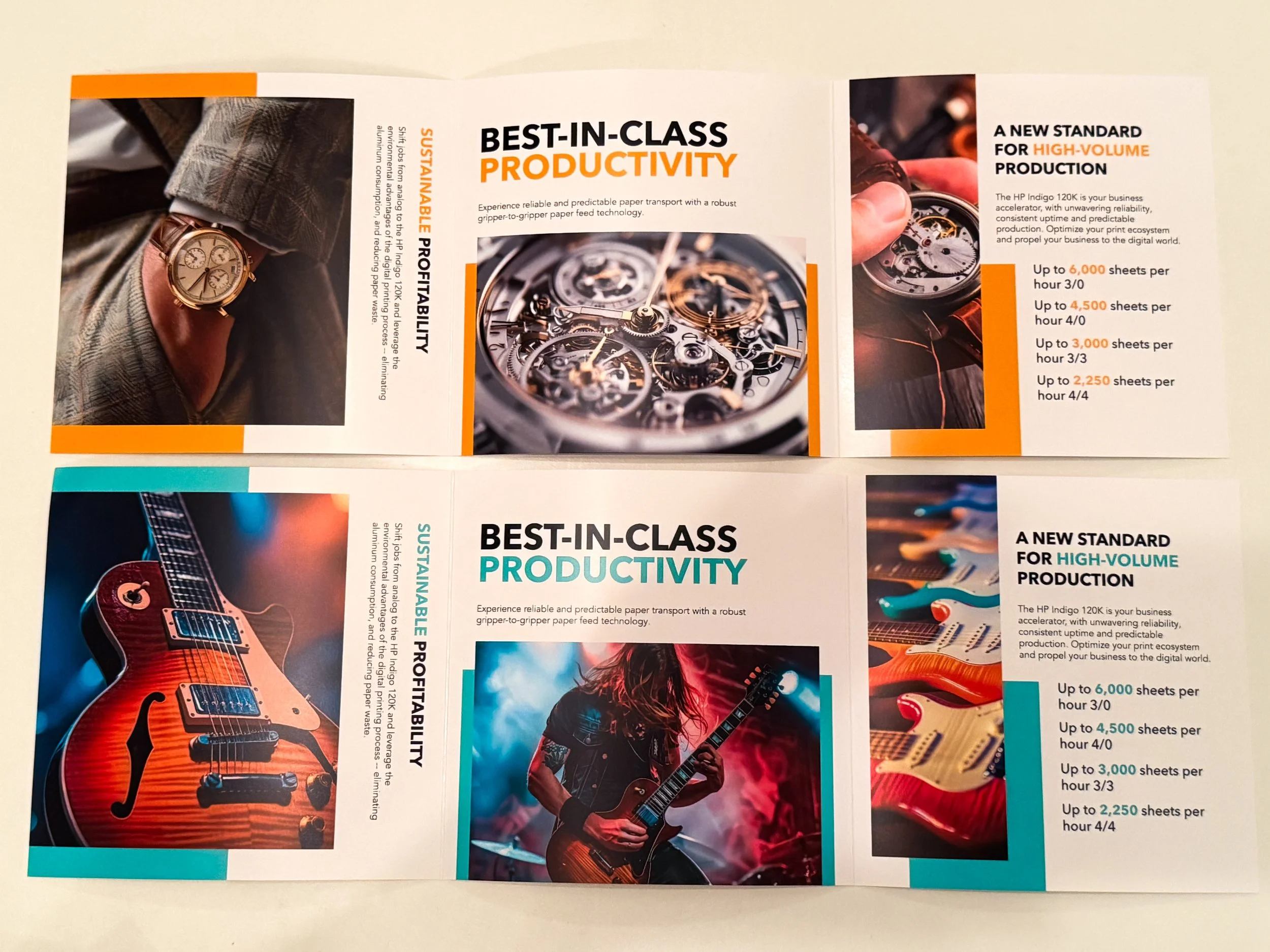
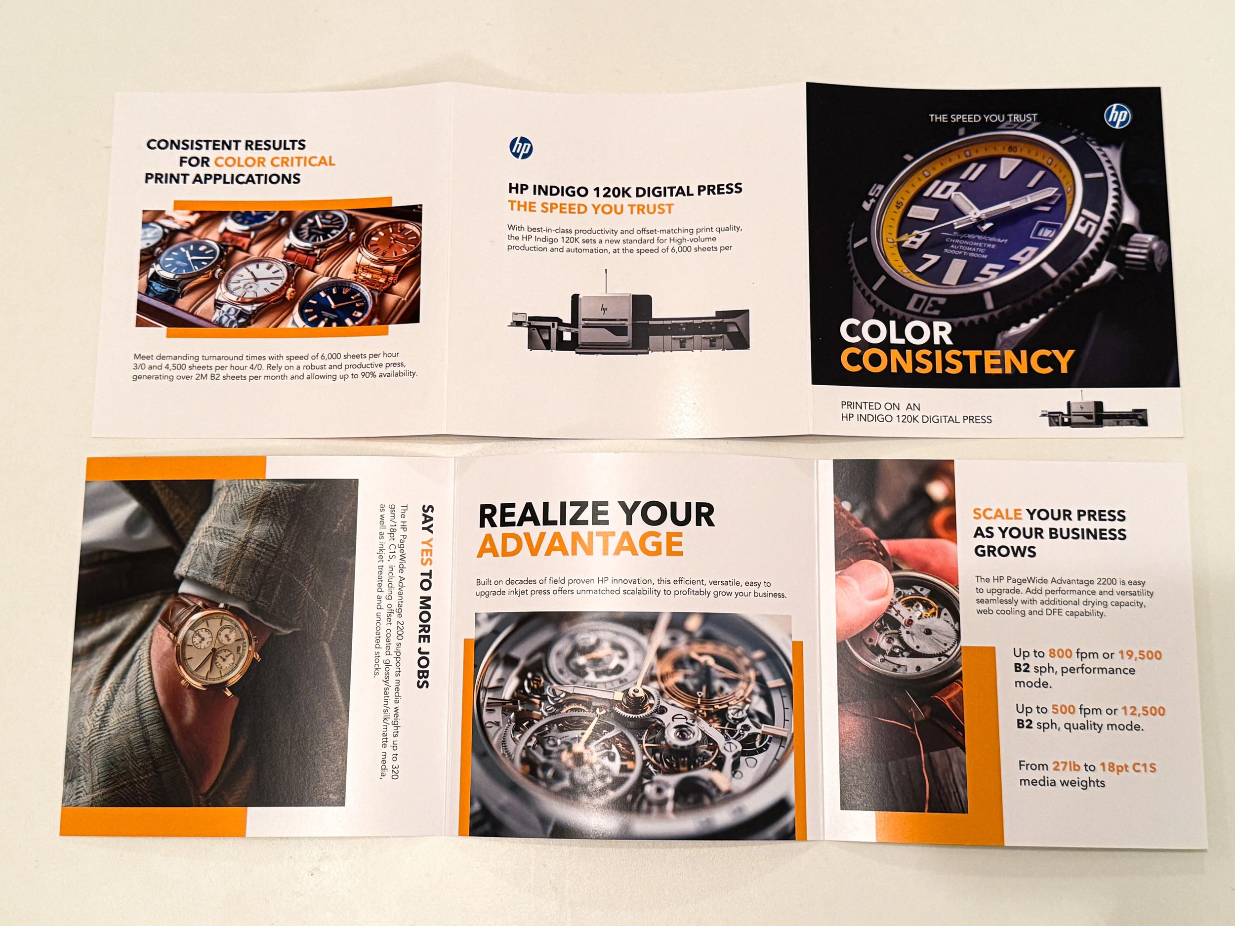
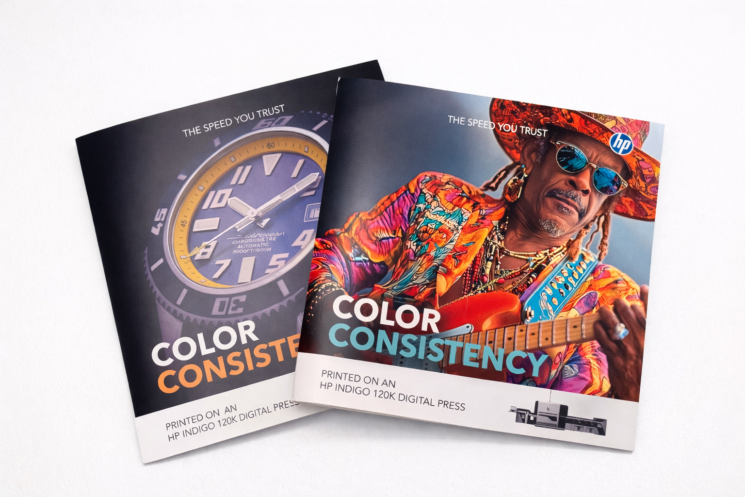
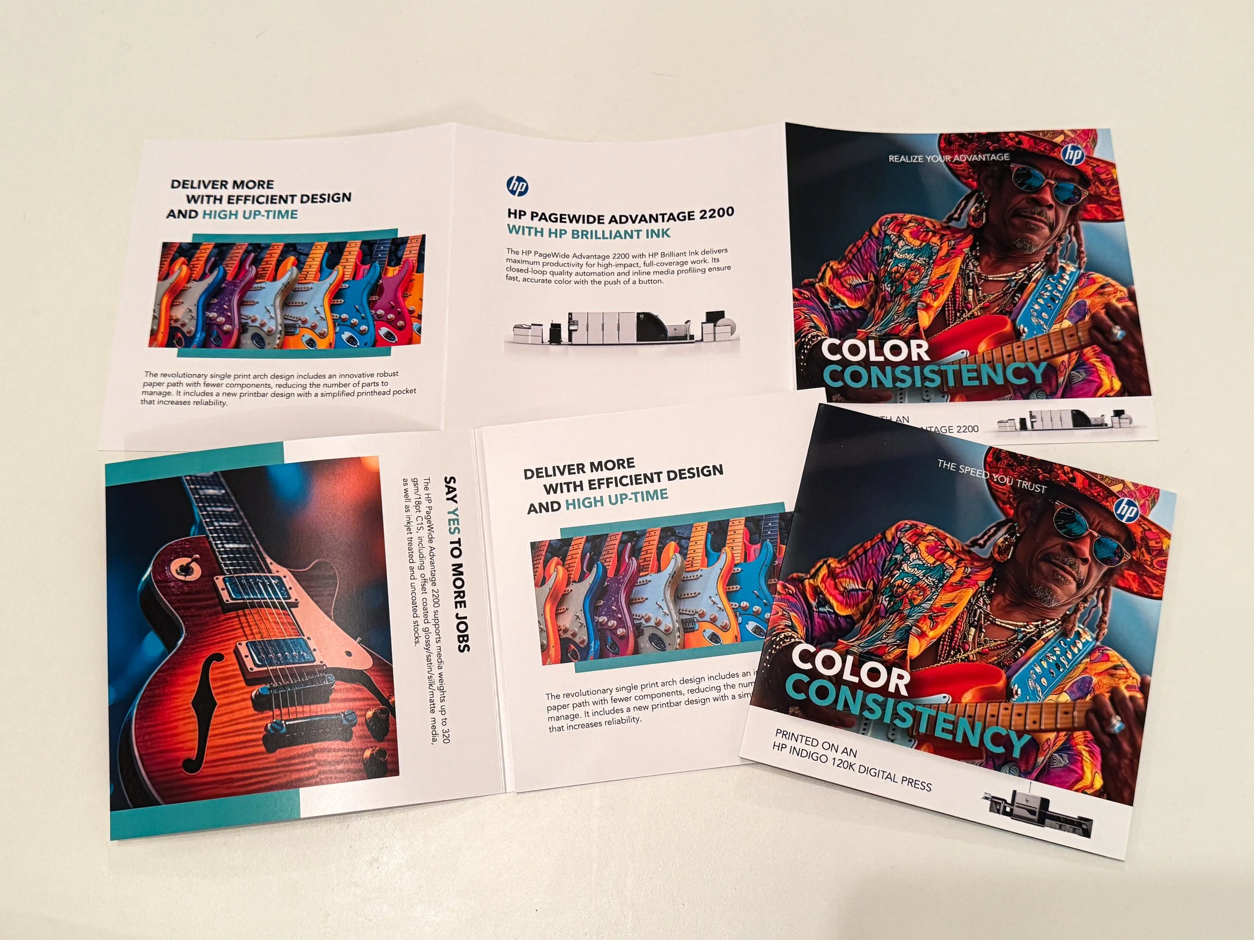
These tri-fold brochures were created for HP to support sales efforts for the HP Indigo 120K and PageWide Advantage 2200. The goal was to demonstrate color consistency across both presses through a clear, side-by-side comparison in a printed format. The brochures were distributed to customers following webinars, used in demos and sales presentations, and given out at trade shows.
Scope:
Designed a series of tri-fold brochures for the HP Indigo 120K and PageWide Advantage 2200 to support press sales efforts
Developed the layout and visual design to clearly communicate and compare output across both presses
Focused on demonstrating color consistency between two distinct printing technologies
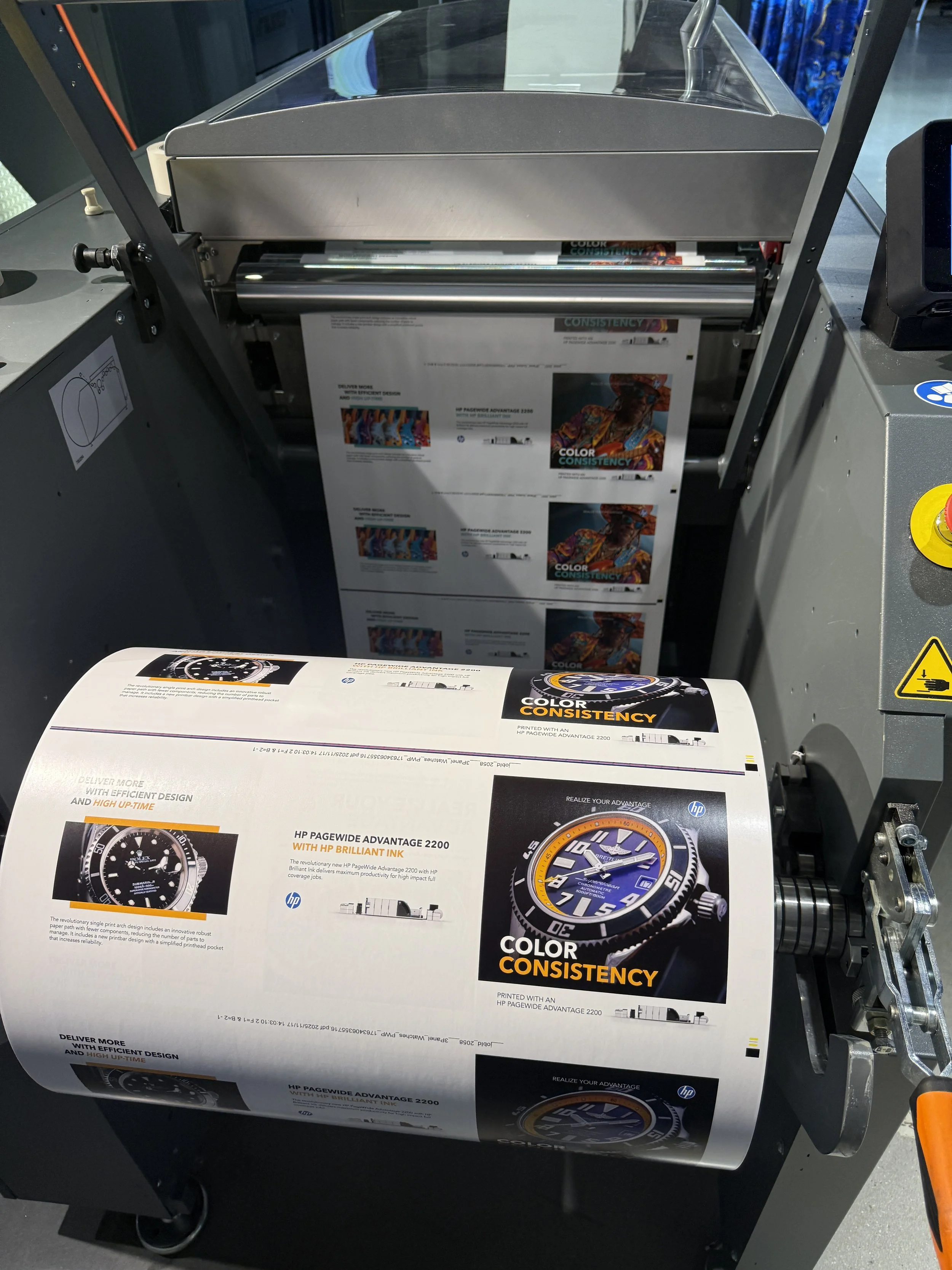
Prepared files for print and distribution as part of customer-facing materials
Created assets used in webinars, follow-up outreach, and live sales demos
Impact:
Created a valuable sample piece included in sales kits for the HP Indigo 120K and PageWide Advantage 2200
Supported sales efforts by providing a clear, tangible example of color consistency across both presses
Used in webinars and live demonstrations to help communicate print capabilities to potential customers
Reinforced client understanding of output quality and consistency when evaluating different printing technologies
Summary:
This project strengthened my ability to design clear, effective layouts that communicate technical information in a way that is easy for clients to understand. It also reinforced the importance of using design to support sales conversations and highlight key product capabilities.